How I used augmented reality AR to create an inclusive experience for users with disabilities
November 1, 2021
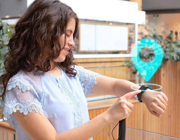
A new navigation experience for the visually impaired
Access to information remains one of the biggest accessibility gaps for people who are visually impaired. This is especially the case when it comes to navigation. Simply knowing your location, getting disoriented, knowing what places are nearby like nearest intersection are just some of the vital information that blind and visually impaired travelers are missing whenever they leave their home. Unfortunately, the common map apps used by sighted people remain inaccessible to blind and low vision users. There are now a variety of mobile apps for the blind that attempt to provide a reliable and better navigation experience.
The Sunu App integrates seamlessly with the Sunu Band to provide GPS and way-finding information ‘on the go’, in a way that is accessible to blind and low vision users. With the App the user can know where he is, what places are around him, start navigation to a place, and more. The user can access all Sunu App features from the Band’s interphase without the need of taking his phone out, making the navigation experience more convenient and safer.
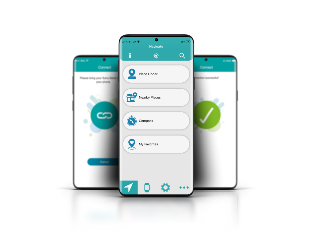
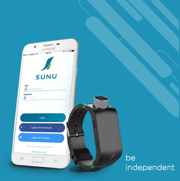
The Sunu Band is the first intelligent mobility aid that connects to a mobile app, which is available for Android and iOS. The mobile app allows users to receive free device updates, customize the device and unlock a variety of features. Users are able to customize the device’s haptic feedback, its sonar range and detection area with the app. Additionally, some of the features included with the app are: a phone finder, an alarms app, activity tracker, and a compass. The new Sunu App includes an entire suite of navigation and way finding features.
At the core of the app is its tight integration with the Sunu Band. Users are able to control and activate navigation features directly from their Sunu Band, without having to take out their phone. This alleviates the stress and social anxiety for blind users who are typically targeted for theft. With the app paired to the Sunu Band, the user can:
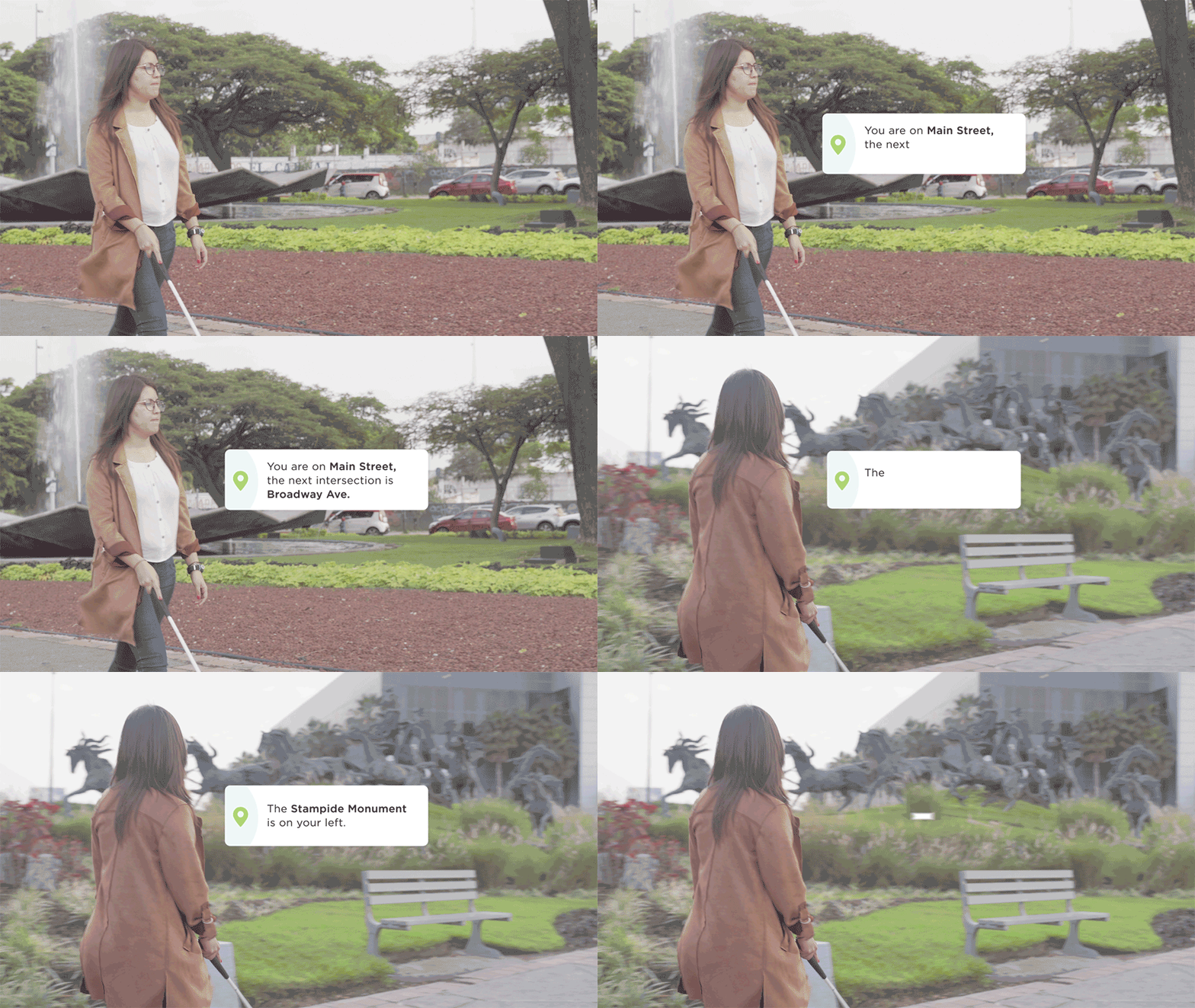
- Access location information on the go. You can request the address of your current location, receive the street names and closest intersections. Get information about nearby places that are within your path.
- Explore the surroundings with Augmented Reality. You can know about places in the direction in which you’re pointing your hand. You can search using categories and range with the Place Finder.
- Navigate to a destination. Users receive turn-by-turn directions via voice and haptic feedback. The Sunu Band’s hand-pointing compass keeps ensures that the user is always going in the right direction.
Role: Product Manager
UX and Accessibility Design
We’ve employed design thinking methodology to understanding the user’s pain-point and problems around using mobile app for navigation and way finding. My role on the product team was to:
- Lead the user experience design (UED) of the app for both iOS and Android.
- Lead the accessibility design of the app.
- Coordinating the writing of the design and technical requirements documentation.
- Design and carry out the internal QA and testing of the app.
- Design beta testing of the mobile app.
Our chief executive officer led the team. I reported directly to our CEO and worked closely with:
- One full-stack engineer.
- Two mobile app developers.
- One web-systems back-end developer
- One graphics designer.
Process: Initial UX & Accessibility Design
We employed Agile methodology throughout our product development. We primarily worked on a two-week sprint schedule, using Atlassian tools like Jira for project management. The development of the new navigation app had proceed in phases since it will replace the existing app. During this initial design phase, I primarily worked with the Product Owner and graphics designer. Our process was:
- We’d interview users in order to test and validate the core solution hypothesis.
- Defining each core feature of the app and writing the user stories for each.
- Create a wireframe and low fidelity mock up.
- Write the design requirement and technical requirements doc in collaboration with the lead engineer.
- Proceed to build phase.
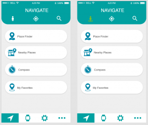
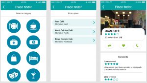
I employed tools like Moqup and Adobe XD for the UX design work. The accessibility design work was included within the technical requirements documentation. This included all voiceover texts and design requirements for large fonts and high contrast. The following image shows some of the low fidelity mock ups that I designed:
I also simulated the user flow for the features within the app. For example, this image below should how the Place Finder feature works:
I then worked with our designer and with engineers to ensure that all designer requirements were met throughout the engineering cycles.
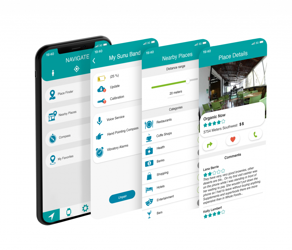
The app now includes a tutorial and a guide for use with the Sunu Band.
Accessibility Design – Lessons Learned
There are a lot of considerations that I learned when designing the app’s non-visual interface:
First, Voiceover (VO) on iOS and TalkBack (TB) functional quite differently. It’s important to understand how each function with elements within the app, such as sliders, toggle switches, fields, etc. It is important to consider the user actions or flow that the app is requiring from the user. Basically, you need to provide enough contextual information via audio to the user. For example: As a user, why should I adjust the slider or toggle a switch?
Second, prioritization. Each system differ on how it prioritizes the voice prompts to the user. It’s important to understand the hierarchy within each system. Again, user action and flow have to be considered. This especially get complicated when the phone is communicating with an external device such as a wearable.
Third, design considerations for low vision users. It is super important to understand how certain elements behave when the low vision user adjust sizing and screen contrast. This is especially relevant when employing containers within the app that include icons and texts. Certain elements within the container may ‘blow up’ when the user adjusts for larger sizes.
Process: QA & Accessibility Testing
I designed the internal testing scripts and requirements. Having a well defined test script or instructions allowed out team to quickly perform the necessary quality assurance and user testing by identifying bugs and moving through the scrum.
I followed the same procedure for performing accessibility testing. I coordinated this testing with 3-5 blind expert users who could quickly assess the apps UX and functionality from an accessibility point of view. This includes testing the VoiceOver and the experience with the non-visual interface.
I also tested for other accessibility features such as large fonts and contrast. We are able to design for a dark-mode version of the app.
The iOS app is currently in Beta with around 25 to 40 users and is in its third round of testing. The Android app is now in public beta with over 100 users.
Criteria for Success
The new Sunu Navigation for iOS and Android are currently in beta. It is expected to launch in September of 2020.
We’re using Firebase and other in-app analytics to monitor usage and a variety other criteria such as daily active use, DAU, etc. The Net Promoter Score, or NPS allows the team to evaluate how users are responding to the mobile app.
